How can designers take the information desk public?
Competition Launch: June 2004
Original Brief: Download PDF
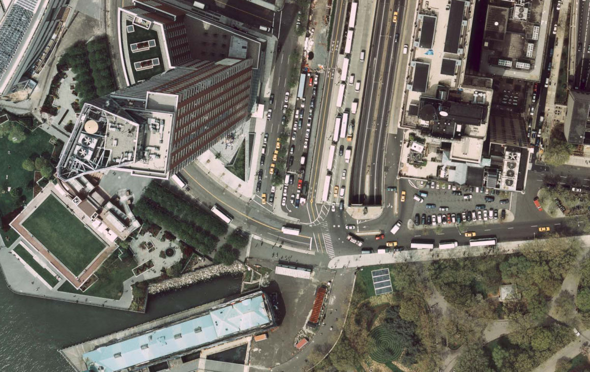
In the aftermath of the 9/11 attacks, Van Alen spearheaded a multiyear initiative to understand and communicate the complex conditions and alternative futures of Lower Manhattan’s urban landscape. Organized in collaboration with the Architectural League and the Battery Park City Authority, this competition sought proposals for a prototypical interactive installation to be sited at the southern end of Battery Park City. Civic Exchange challenged designers to go “beyond the kiosk”—to imagine new ways of effectively organizing and delivering information to the public, and to provide a forum for diverse audiences to interact with and respond to the multiple future scenarios for Lower Manhattan.
The competition built on Van Alen Institute’s earlier Lower Manhattan projects, including a design competition for a temporary pavilion on Wall Street (Culture Information Exchange, 1996) and a map of Ground Zero (New York New Visions, 2001). Rather than extending an open call for finished proposals, Van Alen issued a Request for Expressions of Interest generating responses from professionals in the fields of design, architecture and new media. A jury composed of designers, educators, and public officials short listed four teams, each of which was provided with a $10,000 stipend and an opportunity to refine their proposals. This framework guaranteed funding for the shortlisted teams’ work, and established a dynamic process for teams to receive and respond to feedback from the jury.
The four final proposals, presented in a public discussion in February 2005 at Pace University’s Michael Schimmel Center for the Arts and displayed in an exhibition at Van Alen Institute, offered innovative ways of embedding information in objects, and suggested the diverse forms these objects may take in public space. The jury selected Antenna Design as the winner, recognizing their project’s ability to creatively include seating, a space for gatherings, easy access to multiple levels of information, and energy efficiency. In Summer 2005, Masamichi Udagawa and Sigi Moeslinger of Antenna Design discussed their winning proposal at Walker Art Center, Minneapolis.
jurors
Stage One
Janet Abrams, Director, Design Institute, University of Minnesota
Kadambari Baxi, Partner, Martin/Baxi Architects and Principal, imageMachine
Tucker Viemeister, President, Springtime-USA
Stage Two
Janet Abrams, Director, Design Institute, University of Minnesota
Stephanie Gelb, Vice President, Planning and Design, Battery Park City Authority
Joyce Lee, Chief Architect, NYC Office of Management and Budget
John Maeda, Co-director, SIMPLICITY Consortium, MIT Media Lab
Michael Rock, Partner, 2×4, Inc.
Tucker Viemeister, President, Springtime-USA
winners
Grand Winner ($10,000)
Antenna Design
Masamichi Udagawa – Principal, Antenna Design
Sigi Moeslinger
Bruce Pringle
Gaspard Giroud
Veronique Brossier
Jonathan Brzyski
Project Description
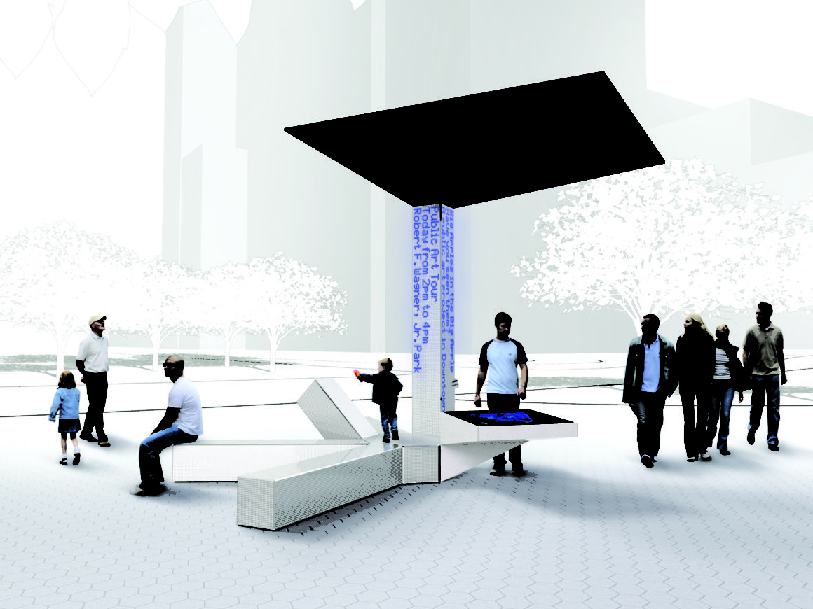
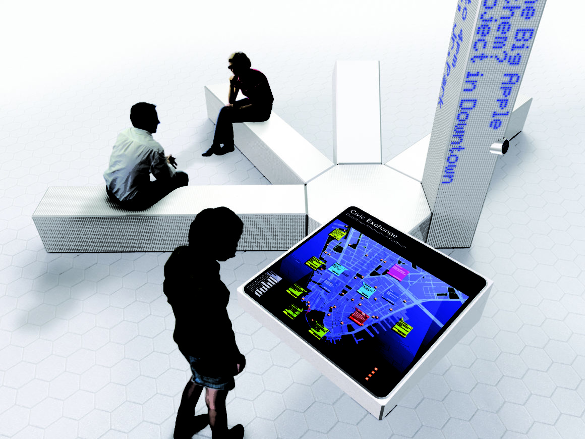
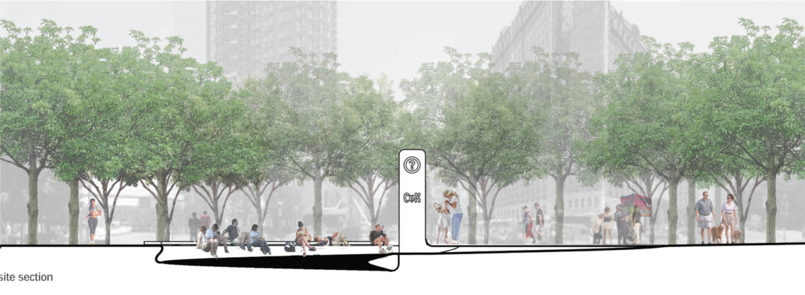
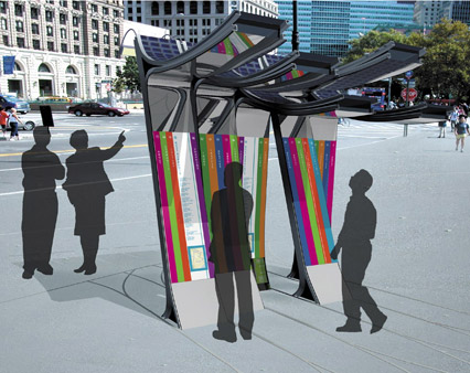
This installation becomes a beacon in the environment. It is an easy access point to useful local information and a public space for social interaction. The digital information displayed encourages activities that range from the purely practical to the educational and entertaining. The design was inspired by the image of people gathering around a bench under a tree, as found in city parks. The installation features the following components:
• The main information screen is a multi-user interactive map table. The interactive map of Lower Manhattan provides direct access to place-based news, events, alerts and other information. People can engage in community dialogue by responding to polls, articles and by annotating the map.
Local organizations can produce content for specific place-based activities.
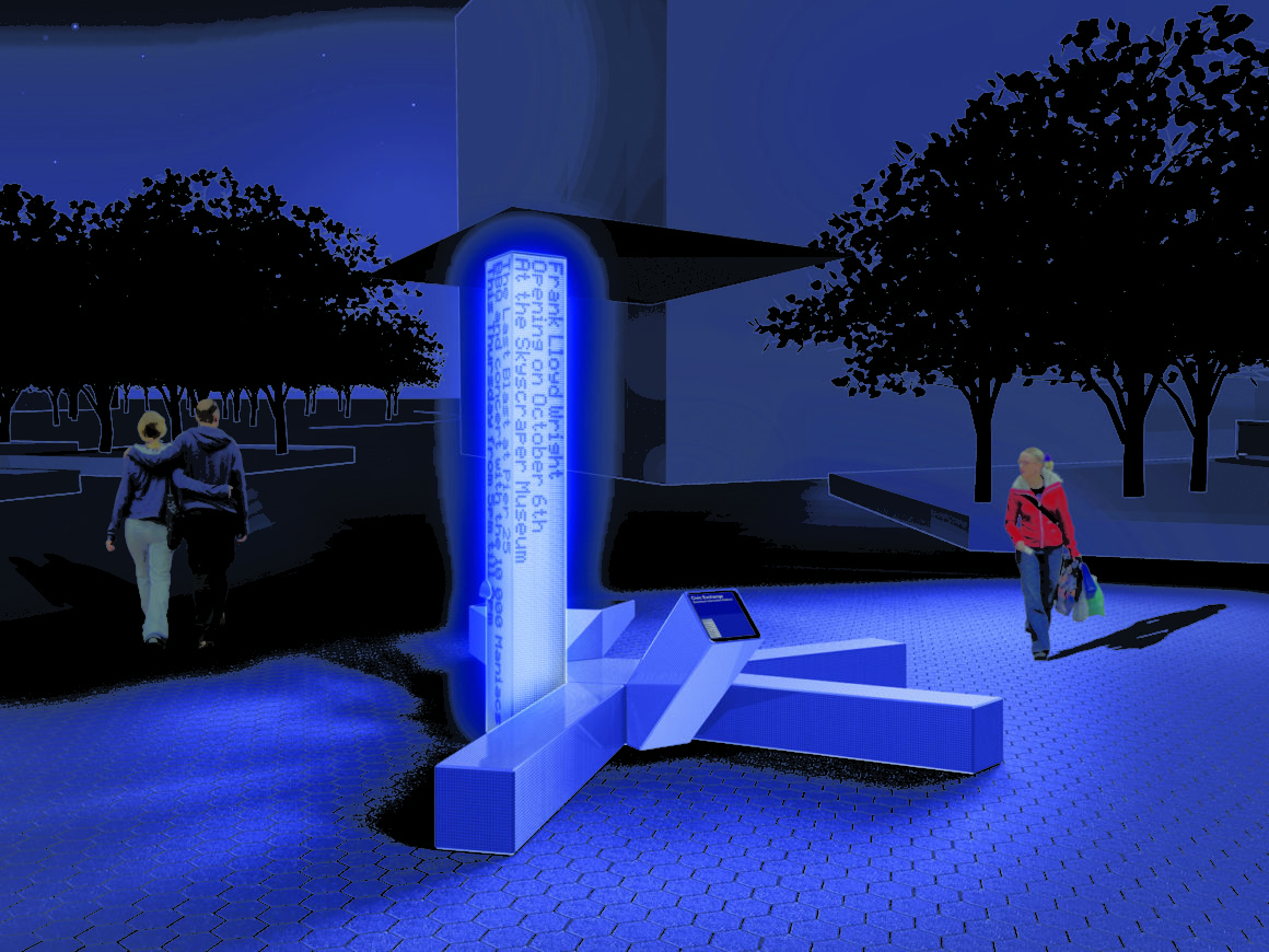
• A public announcement screen in the form of a LED column presents broadcasted as well as inter actively invoked content. The various types of information are distinguished through color and motion. Normally, text is animated in a poetic manner, respectful to the residential and recreational neighborhood. In alert or emergency modes, messages are presented to command attention. Also integrated into the column is an emergency intercom.
• A single-user internet terminal allows for private exchange.
• Seating modules invite people to gather together.
• A roof with solar panels, which provides partial and back-up power, offers shade for the interactive display and acts as a shelter from the rain. The physical components are designed as a modular system, like a “hub” with “spokes”, which can be tailored to the requirements of various locations. Key to Antenna Design’s project is their ability to take readily available materials and appropriate them in inventive ways. For example, by embedding LEDs behind glass mosaic tiles, which are framed by in a stainless steel grid for durability, they are able to subdue the luminous “Times Square” quality of the diodes and unifies the display with the rest of the installation.
Finalist ($10,00)
Leeser/StoSS/Levin/Kurgan
Thomas Leeser – Leeser Architecture
Golan Levin – New Media Artist
Chris Reed – Principal, StoSS Landscape Urbanism.
Laura Kurgan – L00K, Laura Kuran Design
Project Description
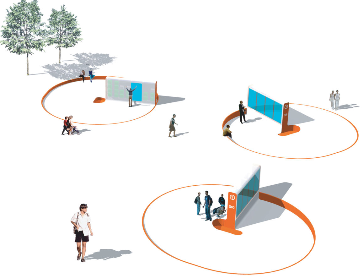
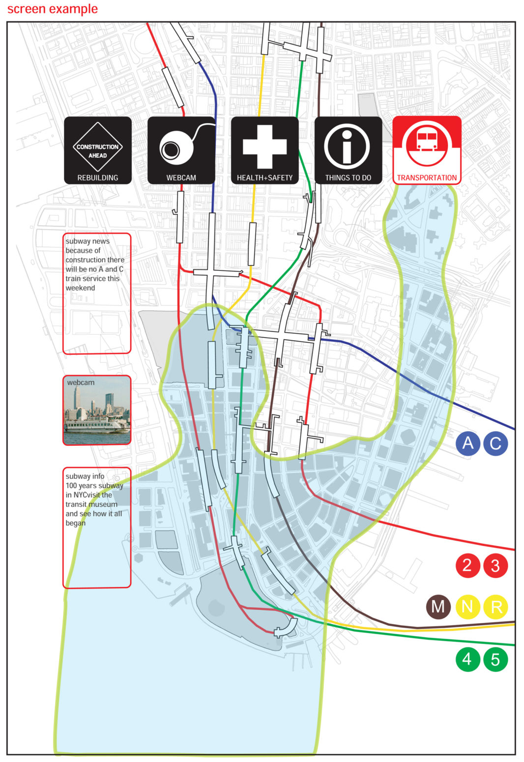
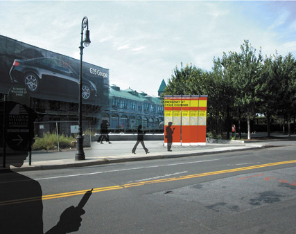
This project proposes a modular free-standing structure, which is inserted into the landscape as a small sunken circular space. Plasma screens that are six feet by six inches high are mounted back to back in a translucent Corian box which houses back-up batteries, as well as necessary power links to the grid. One side of the screen broadcasts information, while the other presents an intuitive interactive interface. The structure is eight-feet-high and can be installed in widths of five feet, ten feet, fifteen feet or twenty feet. Embedded in the structure is a pico-cell antenna. When viewers register with the system (1-800-NY CALLS, or via the internet), they will receive calls providing precise place-based information within a 200-foot-radius of the installation. This pico-cell could be linked to a network of other cells throughout the city in similar installations, or as an invisible cell zone which calls you once you enter its boundary zone. This project presents a simple interface which visitors can easily use to select and navigate a variety of content displays. The interface makes use of computer-vision-based tracking technologies, and thus, allows hands-free interaction at a variety of spatial scales. The user is presented with five virtual buttons above their head and uses their hand/body to navigate the interaction environment. The other side of the installation is partly advertising, partly civic information, and partly the display of human portraits that have been captured from cameras placed around the site. The program filters data captured from relevant websites and randomly displays information in a moving sequence. The system has two components: a confined set of choices, allowing one to get to the information one wants when one wants it, and simultaneously, a free-form range of information that can be accessed in an and unencumbered way, not unlike the chance encounters made possible by civic space.
Finalist ($10,000)
Mesh Architectures / ORG inc
Eric Liftin – Architect and Founder, MESH Architectures
David Reinfurt – Graphic Designer and Founder, ORG inc.
Leo Villareal – Artist
Nina Rappaport – Architectural Historian
Project Description
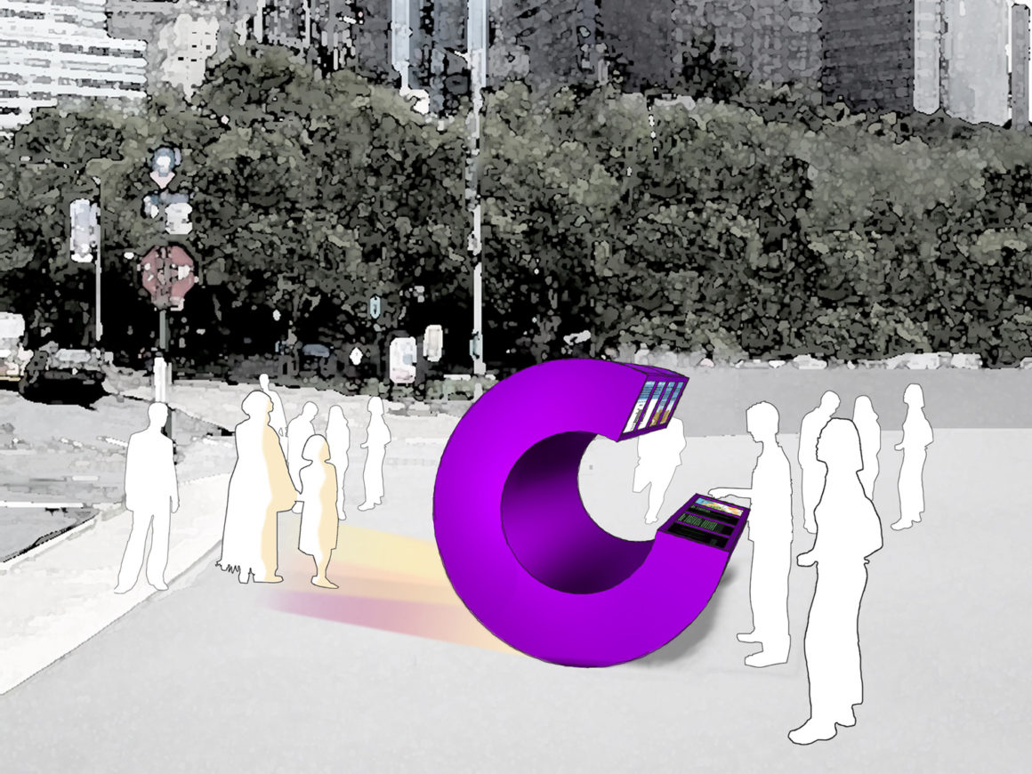
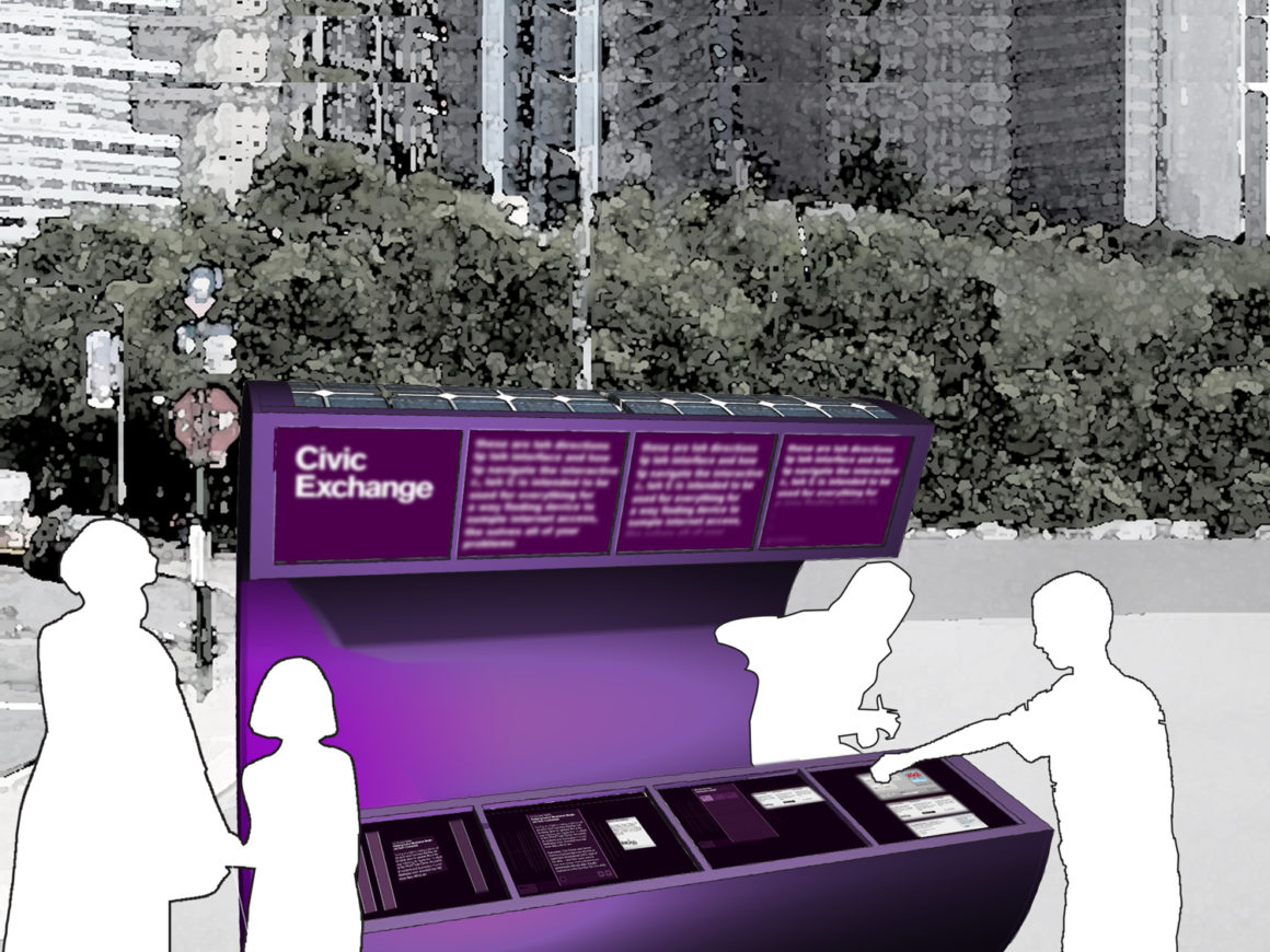
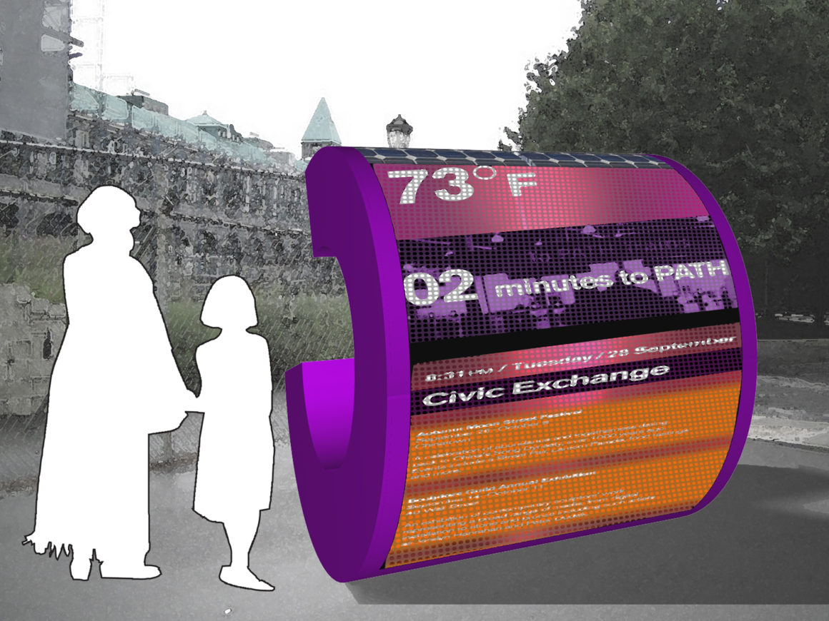
The letter “C” (for Civic, City, Community, etc.) creates an iconic form and a strong visual identity for the Civic Exchange. Its 15-degree tilt and distinctive purple color help the C become a familiar logo. Scaled to human size, the C naturally accommodates an inside and outside. One side engages people and is open and receptive, and the convex exterior displays information. The ends of the C are well-positioned to hold screens at an accessible height. Through a linear band of information, the C interface aims to simplify the presentation of heterogeneous information by separating it into: Events, History, News, Rebuilding, and Transportation. Each of these modes is an extended timeline, with a line marking each event or news item. The length of the line reflects information such as how highly the item is rated. When a band is touched, the information becomes visible. The convex side of the C is an LED screen, large enough to be read from a distance. It faces the street so it can be seen by pedestrians, cars, and nearby residents. A sequence of bright, hi-resolution images and messages scrolls continuously from bottom to top. A mix of information, images, videos, and art is tuned to the patterns of site activity. During the day, practical information is combined with messages and images of visual interest. At night, when activity slows down, light-based art predominates and animates the site. A server and wi-fi router enable wireless access to the installation from up to 200 feet away. The inside of the C is left open and becomes a protected space in which three speakers are located creating the possibility for sound pieces and other audio effects.
Finalist ($10,000)
The Exchange
Inbar Barak – Principal, Inbar Barak
Jake Barton – Principal, Local Projects
Claudia Herasme – Urban Designer
Dan Shifman – Interactive Telecommunications Program, NYU
Rosten Woo – Center for Urban Pedagogy
Guy Zucker – Architect
Project Description
The Exchange encourages group use without forcing interaction. It engages different user groups with diverse interests and needs that pass the site at varying speeds. Screens are orientated in multiple directions,which optimize viewing angles for different traffic flows. Cyclists and bus commuters can read the messages at the top of the screens from a distance of 40 feet, while pedestrians can receive a cross section of neighborhood news and community “chatter” up close.
The main features of the Exchange are:
• The information filtering system based on the proximity to the physical location of the object.
• The interface, which is for the community by the community, inspired by the model of the
community garden.
• Its ability to enable a passerby/tourist to understand and learn more about the adjacent community.
• The potential for interactivity, where body movement is the essential element.
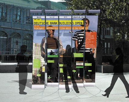
There are two main display elements for the Exchange: the “Media Façade” and the “Directory.” The Media Façade is an ambient visual cross-section of the neighborhood displayed in a clear hierarchy. New and important “official” updates appear at the top of The Exchange and migrate down the screen as they decrease in importance. Messages from the community appear at the bottom of the screen, growing in size and moving upwards as people interact with them. The backdrop is an ambient video mirror that attracts users with playful, yet subtly responsive interaction design. This surface uses “Magink,” which is a passive reflective display technology. It is essentially a dynamic paper, not an internally lit technology like LED or LCDs. The Directory at the rear of the Exchange is a group interface that allows one to find out about activities and places of interest in the neighborhood. These vertically-oriented lists of restaurants, cultural locations and walking tours are constantly updated and ranked to reflect their popularity within the community.
resources
Sponsors
National Endowment for the Arts
The Stephen A. and Diana L. Goldberg Foundation
ADDITIONAL INFORMATION
Sponsors
National Endowment for the Arts
The Stephen A. and Diana L. Goldberg Foundation
Partners and Collaborators
Architectural League of New York
Hugh L. Carey Battery Park City Authority
For more information visit:
The Architectural League
Hugh L. Carey Battery Park City Authority
Antenna Design
Lecture Webcast: Antenna Design
