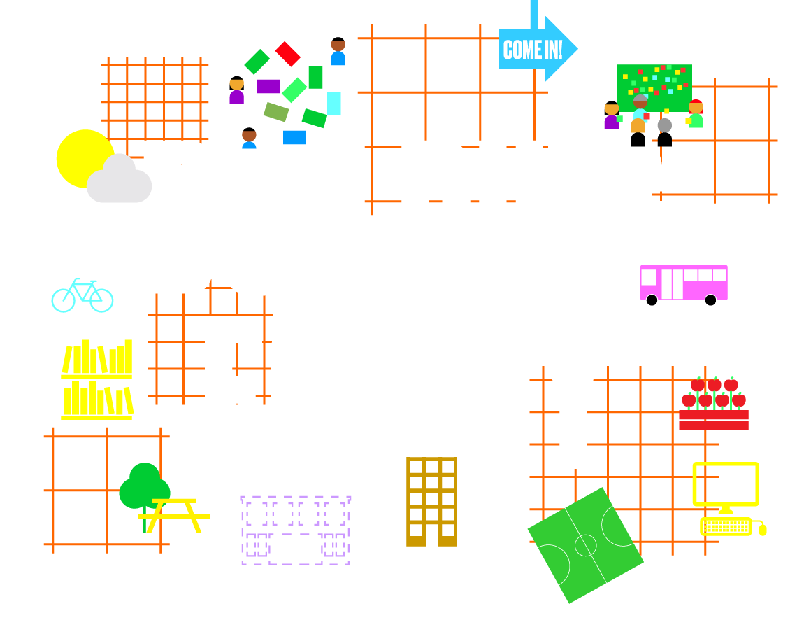
Our firehouses, day care and senior centers, police precincts, libraries, and dozens of other public facilities are some of our most important shared spaces, as well as powerful physical and symbolic reminders of the role government plays in our everyday lives. How can designers, government officials, residents, and many other stakeholders ensure that these civic spaces truly serve everyone equitably?
To approach this question, the New York Department of Design and Construction (DDC) and Van Alen Institute collaborated on Building Equity, a series of workshops to explore how civic buildings and infrastructure can be more equitable. Workshop participants were a multifarious range of community members, social service advocates, artists, law enforcement officers, researchers, cultural leaders, policymakers, planners, and designers. They were united by their frequent use of public buildings and services.
Building Equity culminated in five propositions for how designers and policymakers can integrate equity when giving form to public buildings. Enlivened by quotes, photographs, and examples from workshop participants, the propositions can be applied to a range of design projects in New York and beyond. They are launching points for the continued growth in knowledge of designers, city agencies, and policymakers working in the ever-evolving urban sphere.
THE NEW YORK WORKSHOPS
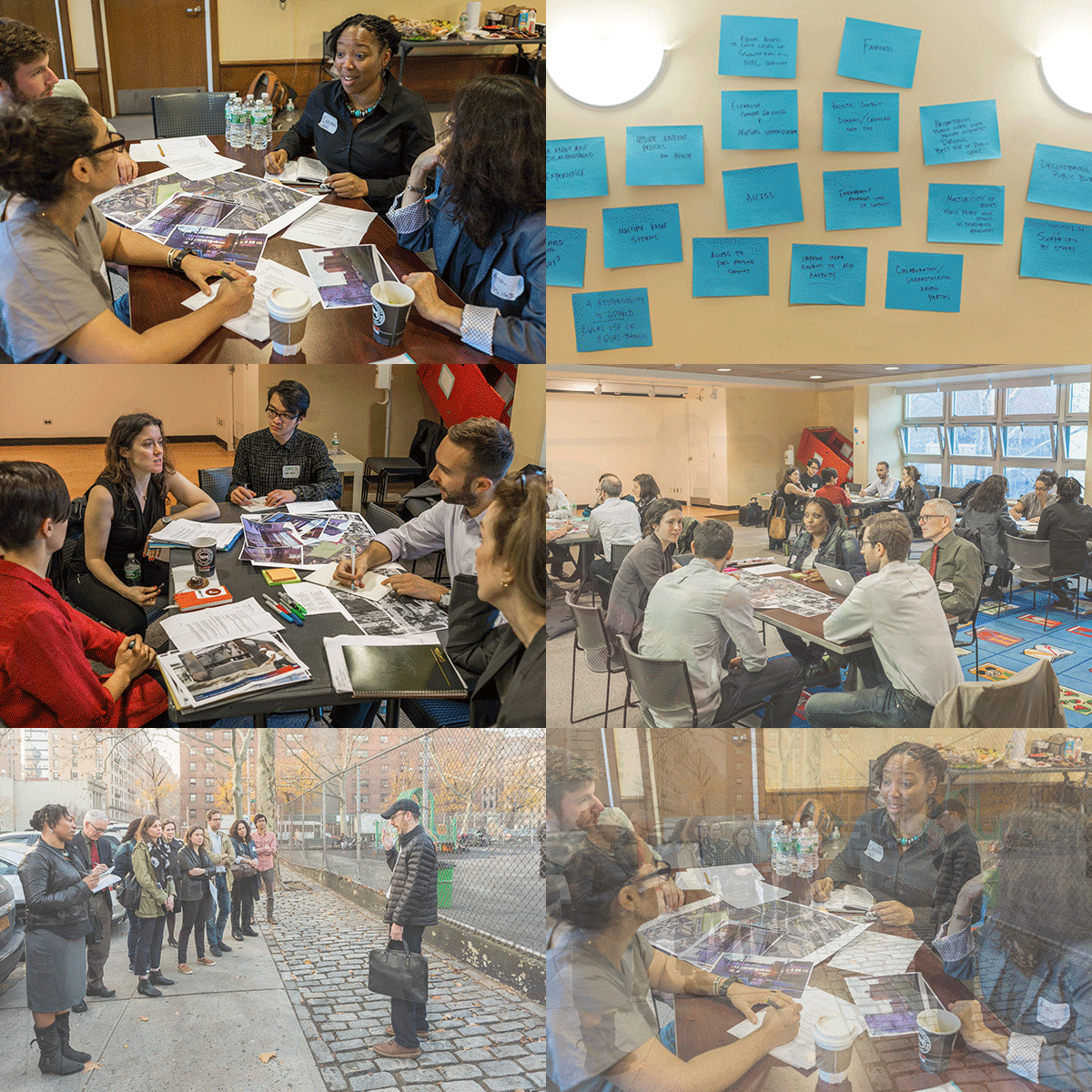
WORKSHOP I: BLOOMINGDALE LIBRARY
In December 2015, workshop participants joined forces at the NYC Bloomingdale Library to tour and discuss a cluster of public buildings and the space that unites them around the Riverside Health Center on 100th Street, near Amsterdam Avenue in Manhattan. This site was selected for its high concentration of public buildings on one neighborhood block. Working together, the participants reflected on the potential for service sharing and mutual reinforcement among the local organizations at the site.
PARTICIPANTS
-
- Drew Berner, Bloomingdale Library
- Ana Crenovich, P.S. 163, Alfred E. Smith School
- Julia Day, Gehl Architects
- Susannah Drake, DLANDstudio
- Stephen Jones, 24th Precinct Community Affairs
- John McDonnell, 24th Precinct Community Affairs
- Besiki Kutateladze, CUNY Institute for State and Local Governance
- Gita Nandan, Thread Collective
- Kevin Quinn, NYC Department of Parks & Recreation
- Katie Riley, NYC Department of Parks & Recreation
- Joel Stillman, Normal Number
- Shirley Williams, 830 Amsterdam Avenue Tenants Association
- Sarah Wolf, NYC Department of Health
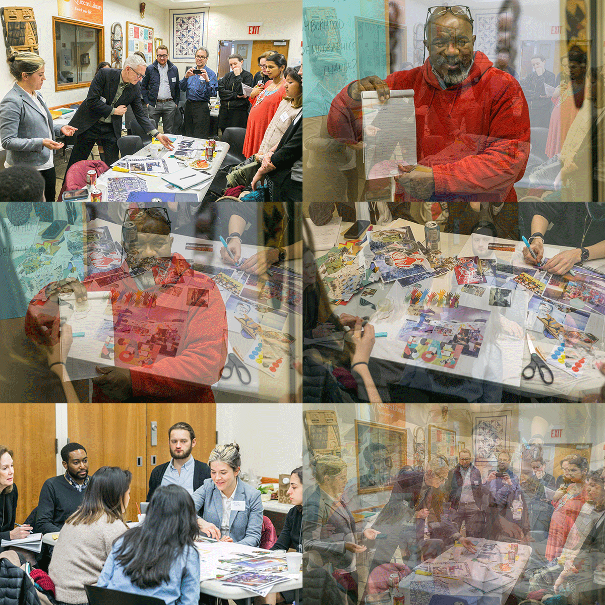
WORKSHOP II: LANGSTON HUGHES COMMUNITY LIBRARY
In February 2016, workshop participants explored the neighborhoods surrounding the Langston Hughes Community Library: Corona, East Elmhurst, Jackson Heights, and Flushing. Corona was at one time predominantly an African-American community, and the library’s substantial collection of African and African-American art represents that heritage. Over the past 15–20 years it has evolved into a primarily Latino neighborhood. Participants considered this demographic shift when raising questions about how public buildings can be designed to remain relevant and welcoming as their surrounding users’ change.
PARTICIPANTS
-
- Andrew Burdick, Ennead Lab
- Arli Cornejal, Queens Neigborhoods United
- John Crow, Langston Hughes Community Library
- Eilidh Dickson, Copenhagen Institute of Interaction Design
- Beatriz Gil, Hibidros Collective
- Larinda Hooks, Elmcor Youth & Adult Activities
- Sahar Khan, Chhaya CDC
- Isabelle Leighton, Asian Americans for Equality
- Clara Londono, Plaza del Sol Health Clinic
- Prerana Reddy, Queens Museum
- Jessica Sanclemente-Gomez, NYC Housing Preservation & Development
- Rachel Schwartz, Public Health Solutions
- Eduardo Staszowski, Parsons DESIS Lab
- Lester Youngblood, NAACP Corona
OUR PROPOSITIONS
“For so many, the public plaza or the library functions as a living room. In dense, lower-income neighborhoods, public amenities can provide space and services to residents that often can’t be accessed at home.”
“Be cautious of scripting gendered spaces.”
I. TO TREAT NEIGHBORHOODS EQUITABLY, TREAT THEM DIFFERENTLY
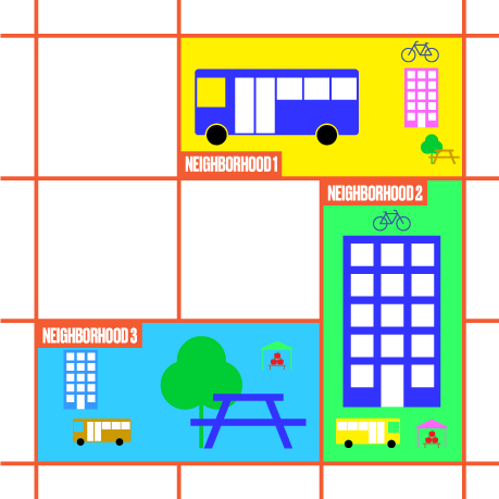
Different neighborhoods have varied needs, and statistics do not tell enough of the story. Yes, numbers of elderly inhabit some neighborhoods, while others overflow with young families. Older, single people may feel isolated in some communities. Meanwhile, daycare and transportation options in some city corridors may severely limit whether and where a single parent with children can work. Services and the spaces they use must adapt with the lives of their local inhabitants. With neighborhoods and cityscapes perpetually in flux, designers, and the agencies that hire them, must invest in determining local needs, and make sure that resources and services are available to meet real—if sometimes new—needs.
For designers and policymakers, the difference between “equity” and “equality” is crucial. An equal provision of government resources will inevitably offer more than is needed in some communities and underserve others. An equity approach assesses essential services and amenities, especially in traditionally under-resourced communities, and focuses on populations that can be hard to reach: those vulnerable to homelessness, those isolated from health services, and those likely to be heavily impacted by disasters or a personal misfortune, for example.
“A space can create anxiety if it’s not clear where to go or what to do. People are afraid to take ownership of the space.”
“…a space needs to stand for something!”
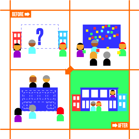
II. NURTURE COMMUNITY HISTORIES AND INSPIRE LOCAL OWNERSHIP
What does a building signify within the larger context of its surrounding neighborhood? Buildings and spaces are encircled by social, cultural, and built emblems of their local community life. Not all local voices and stories
are heard, however. Some are obliterated over time. Peoples’ “histories”—in the broadest sense—can do much to make public services and structures effective, accepted, and nurtured.
Great public design is a balancing act. It succeeds when residents are able to articulate their needs and work collaboratively with agencies and design teams in the development of a project scope. This process is not about one kind of aesthetic versus another. It is about the stance a design project takes to its surroundings — an insightful, not knee-jerk, approach to context — and the relevance of a space’s function to needs, both present and future, so that likely futures can be understood.
A successful, collaborative building-design process is much more likely to result in acceptance by community members and civic leaders. Such projects will inspire stewardship over time.
“Youth feel like, ‘don’t tell me what to do, but give me enough structure to do something.’ Don’t force someone’s hand.”
“Design buildings like software — constantly evolving.”
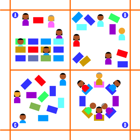
III. SOME SPACES SHOULD NEVER BE FINISHED
Good public spaces are alive; they shape-shift with changing times and resources. Designers must find a happy medium between over-designed and purely flexible spaces, providing subtle cues to use without “forcing someone’s hand.”
Some public-building designs can be quite intricate: libraries with special areas for children, elderly, and adults; museums with a special room for every collection. Yet change, not stasis, is the norm for most facilities. Spaces that are too specific can become obsolete.
On the other hand, pure flexibility can be unwise. A plaza with broad, paved areas for celebrations can look bleak when unoccupied. Insightful design anticipates changing needs. An alluring paving and furniture pattern can make even an empty plaza feel alive. Maybe a library meeting room is created only when needed with readily demounted partitions. Or, special reading areas are denoted with furniture instead of architectural walls.
“There’s nothing for adolescents in NYC. They are told to be quiet in the library. If they go to parks, they have to hang out near little kids. Teens just need opens space that are welcoming. It’s hard to imagine a place to be. People fear youth, but teenagers are creative — how do you harness boisterousness?”
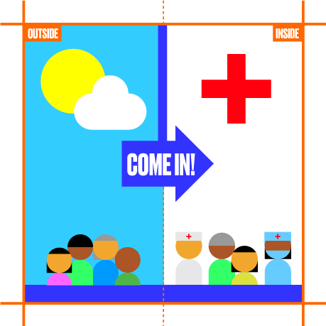
IV. DESIGN SHOULD SAY “THIS SPACE IS FOR YOU”
Designers are trained to create buildings and spaces that have clear intentions and identities — buildings that make a “statement,” sometimes boldly. The workshops suggested that this is not always the right approach. An architect may design a grand entrance that locals find intimidating. An abstract composition may be sculpturally elegant while offering too few cues for its use. Young people, especially, can feel stigmatized by architecture if they live in public housing “projects,” or feel hectored by people in authority if they gather on street corners.
A better approach for designers is to make sure the purpose of the building or environment is absolutely clear and that the invitation to its users is explicit. A workshop participant discussed a non-profit health center that was appreciated because passersby could look in from the street through large windows, and see “people like them” using services. A government facility was feared because it was opaque, did not clearly indicate that services were offered in languages other than English and did not convey that immigration status would not prevent access to services. Cultural and historical cues can appeal to locals without alienating users who can’t “read” those cues. Clear wayfinding communicates that all people are entitled to use a facility.
“Youth would be bereft without technology, but the key is to get them engaged even when they have a phone with them. Design should make technology present but incidental, so you can bring your device, but it’s about sharing activities and space.”
“[Good public space is] a respite for the city. It ties you back to the earth.”
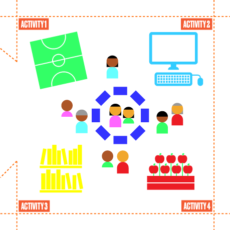
V. EQUITY “GETS IT TOGETHER”
Equitable spaces provide as many opportunities as possible for people to come together—our public buildings and spaces should serve as societal common denominators, places where we meet our neighbors as needs are met. To bring people out, designers could aim to create the ‘non-community center community center’ — an experience that promotes interaction and provides intergenerational activities without the stigma of a typical community center, an idea that could seem antiquated and unattractive to young people.
The non-community center could be unfinished, ready for appropriation by users themselves to suit needs they define. The workshop participants suggested ideas like kitchens to learn to cook, or roof gardens that rely on community cooperation to succeed. The center could also offer gaming spaces that switch to a job skills training hub at night. In offering both passive and active activities, the center would have the ability to appeal to broader audiences with different aims. In the non-community center, the space a book club needs for contemplative discussion has the capacity, in a matter of minutes, to evolve into a vibrant venue for local jazz, or an orderly site of booths for the local farmer’s market.
Another way designers can achieve this is through aggregated public services. Buildings can cross-offer programs that increase overall use.
CONCLUSION
Equity might be traditionally perceived as an issue of government policy or community consensus—something realized through programs or policies rather than bricks and mortar. Our workshops in New York revealed otherwise, and explored the ways in which sensitive, inclusive design advances equity. The propositions in this document and the points below can be used to introduce equity as an essential consideration throughout design projects.
• An equity approach assesses essential services in terms of communities that have been traditionally under-resourced and populations that can be hard to reach.
• A needs analysis convenes members of a community so that they can articulate their own needs and advocate for them. Community-informed design is likely to more accurately reflect genuine needs.
• A community engagement process is not about one aesthetic versus another, but about expression that insightfully speaks to a place and to peoples’ histories and aspirations.
• An enduring design balances specific requirements with the flexibility to adapt to changing needs.
• Design elements that feel unfinished or invite participation from users can be helpful in engaging populations that can be hard to reach, like youth or people who are socially isolated.
• Design elements that welcome, are comfortable, and feel safe are not to be dispensed with when budgets are tight. They are essential to serving needy populations. Services and resources are more useful and effective when people are not discouraged from taking advantage of them.
LEARN MORE
Want to learn more about our equity workshops, including specific examples and ideas for further thinking? Click the link below to download the full PDF propositions document.
